Rethinking Local Discovery
I led Product Design for Yelp's Consumer organization, overseeing the teams responsible for search, discovery, growth, and contributions. We transformed Yelp's home feed from a static search surface into a scalable discovery platform—using intent, context, and local signals to increase engagement, improve retention, and create a foundation for continuous experimentation.
Illustration's by Patrick Riggs
- Role
- Director of Product Design
- Company
- Yelp
- Team
- Consumer Experience
- Surface
- Home Feed
- Duration
- 9 Months

Beyond the feed
Over nine months, I led the evolution of Yelp's home experience from a lightly personalized food feed into a modular discovery surface shaped by community, content, and local intent.
The work challenged Yelp's destination-led model while preserving the strengths of a product built around search. The goal was to prove that richer discovery could increase engagement and retention without weakening monetization.
Hidden in plain sight.
Yelp’s home experience was optimized to move high-intent users to a business page quickly. For everyone else, it offered a largely unpersonalized stream of dish photos with little context for why they appeared.
Meanwhile, Yelp’s richest community signals—reviews, lists, collections, events, and local editorial—were largely absent. The opportunity was to turn home into a more relevant, contextual discovery experience.
What the signals were telling us.
I partnered with research and product leadership to connect behavioral data, qualitative insight, and market patterns. The story was consistent: engagement with the home experience was thin, users skipped its content, and most interactions defaulted to a narrow, restaurant-driven search pattern.
Users weren't moving through the home with intent or curiosity — they were bypassing it and searching instead. My role was to separate isolated observations from the signals that could change our strategy.
These metrics became a shared reference point in leadership reviews, keeping the conversation grounded in user behavior and justifying the shift from incremental feed improvements to a broader platform rethink.
From complexity to clarity.
Yelp's home feed was being pulled in multiple directions. Product, Engineering, Marketing, Research, and Design were each optimizing for different outcomes—and every perspective was valid. The friction wasn't a people problem; it was a clarity problem. No single team owned the whole picture.
I worked with the team to turn the research into three principles: make discovery more relevant, explain why each recommendation matters, and build a system teams could continuously test and evolve. That shared framework aligned competing priorities and gave the organization a clear direction.
- PRODUCT“We need a framework we can continuously test and evolve.”
- MARKETING“We don't have enough opportunities to support campaigns.”
- ENGINEERING“Our backlog keeps growing because every request is custom.”
- BUSINESS“We see untapped growth potential on Home.”
- RESEARCH“Users simply aren't discovering what Home offers.”
Every team was describing a different symptom.
The underlying problem was the same.
What was missing wasn’t another feature—
it was a single strategic framework.
What we chose not to build.
We began by auditing the existing card system. Content types lacked clear identities, interactions were inconsistent, and individual cards were carrying too much information without enough context.
Rather than jumping to a single solution, I structured the work as a set of parallel explorations. Each direction tested a different model for discovery—from social feeds and collections to immersive swipe experiences.
The concepts clarified what Yelp should not become. The opportunity wasn’t another disconnected surface; it was a more flexible system for organizing, contextualizing, and delivering the content Yelp already had.
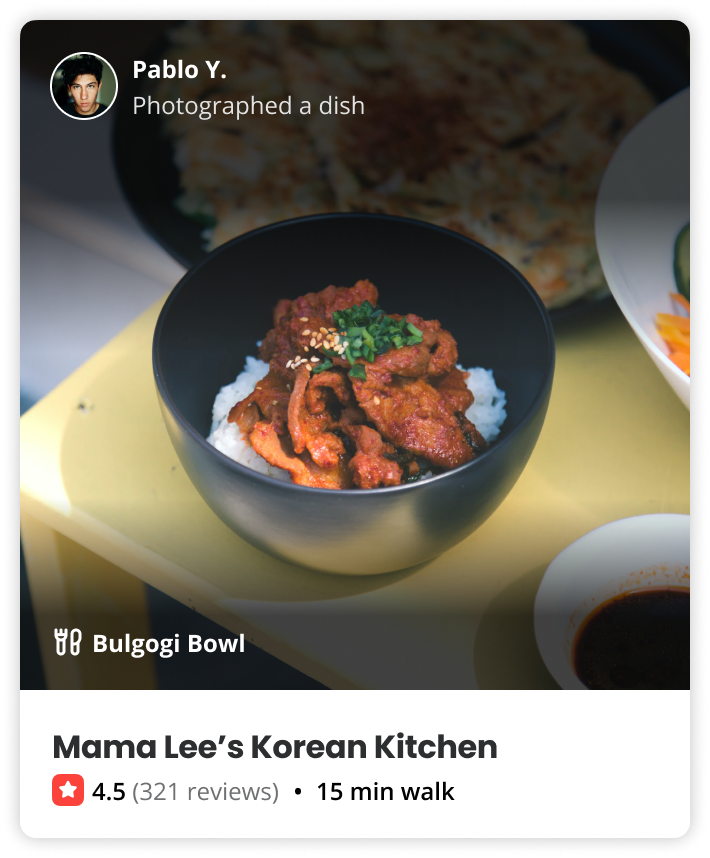
Different content types often felt visually interchangeable.
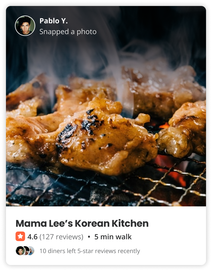
Interactive areas did not always match the perceived purpose of the card.
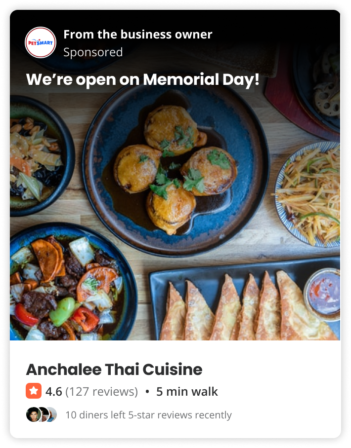
Labels such as “from the business owner” or “shared by someone” did not provide enough useful context.
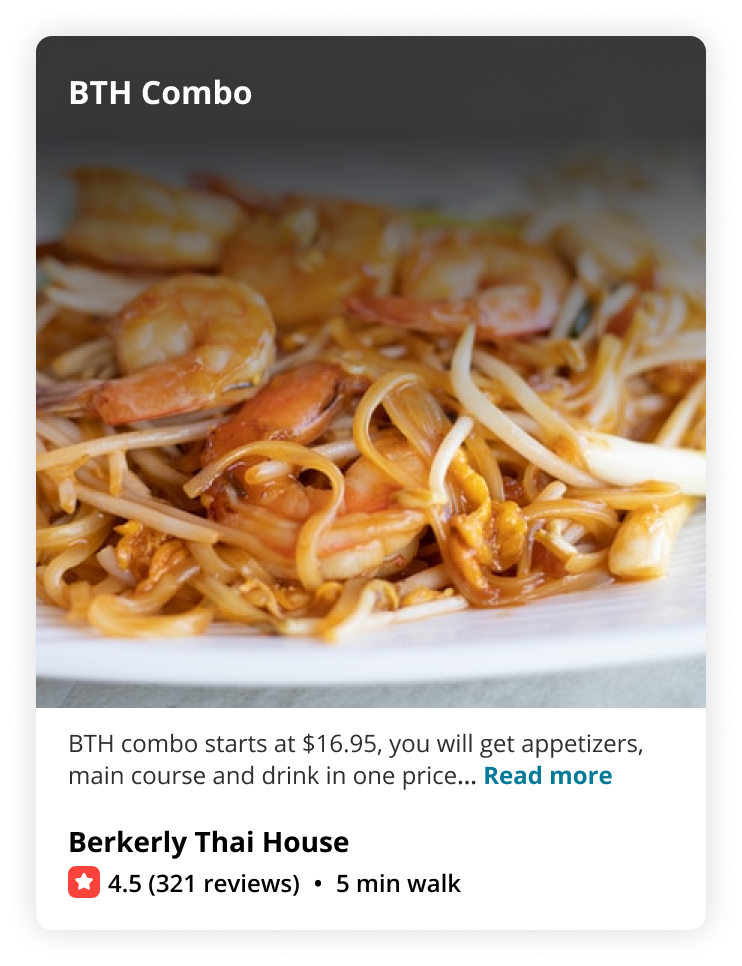
Heavy gradients improved text legibility but cluttered the imagery and reduced card clarity.
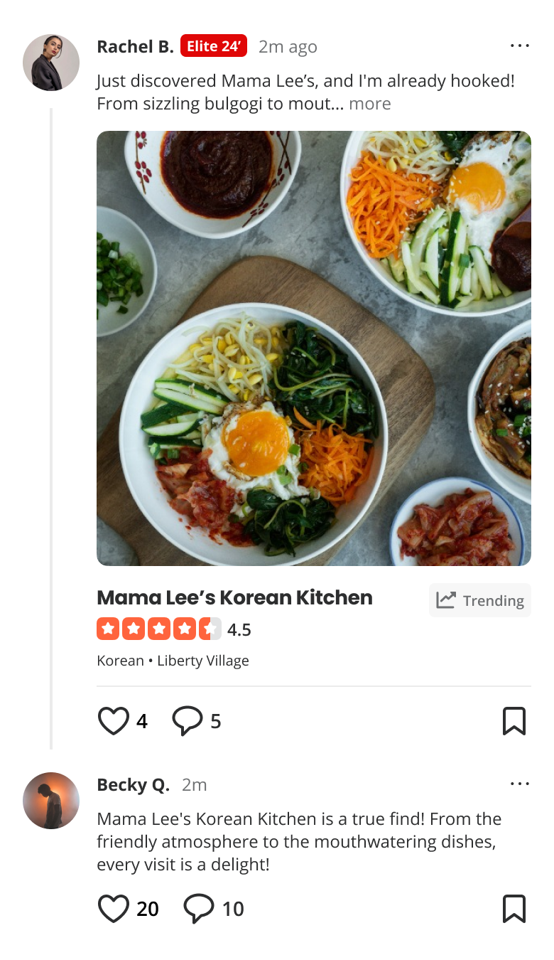
It emphasized posting and interaction when the stronger opportunity was helping people discover relevant places and understand why they should go.
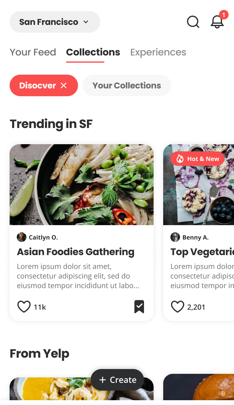
It introduced too many modes, layouts, and navigation patterns—adding complexity instead of making discovery easier.
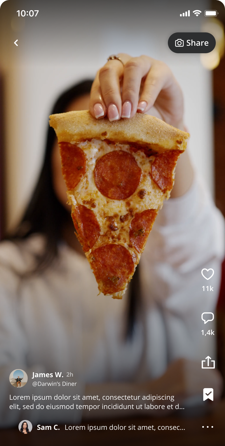
The experience relied on a consistent supply of high-quality video that Yelp could not reliably support at scale.
The challenge wasn’t improving the feed. It was rethinking how Yelp organized discovery around user intent instead of destinations. That realization became the foundation for Hubs & Lenses.
Designing for context,
not destinations.
Rather than designing dozens of disconnected experiences, we introduced a scalable system any product team could compose against. Two primitives did most of the work.
A stable unit of content — restaurants, lists, events, editorial — owned by a product team and reusable across contexts.
A situational frame — time of day, location, intent, taste — that shapes how a Hub is expressed to the user.
The framework reduced complexity while expanding creative surface area. Teams could ship new experiences by composing existing pieces rather than negotiating a bespoke slot on the home.
I encouraged the team to treat the card as a flexible storytelling system rather than a fixed component. That shift let us explore richer content while preserving consistency and scalability across discovery contexts.
A reusable system. Infinite discovery experiences.
A reusable card anatomy.
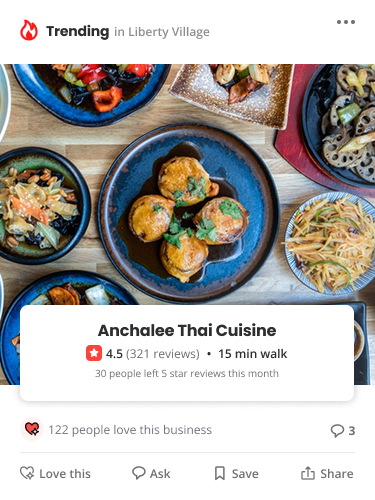
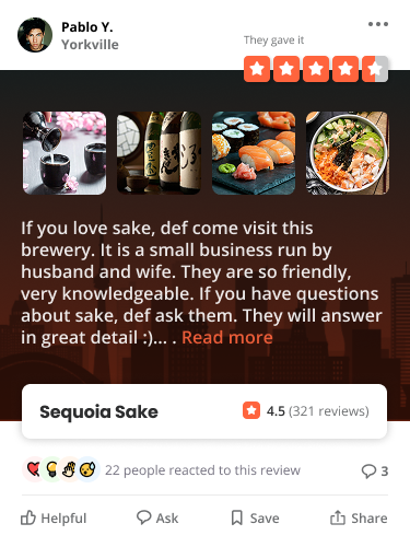
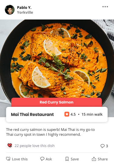
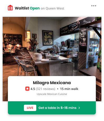
Rather than designing every card independently, we created a shared anatomy every content type could build upon. Businesses, reviews, photos, videos, collections, editorial, and advertising shared the same foundation while adding only what each experience required.
I partnered with design systems and engineering leads to define the anatomy, extension rules, and governance that kept it coherent as more teams adopted it. New experiences became composition, not reinvention.
Content Card (Primitive)
01 / 05
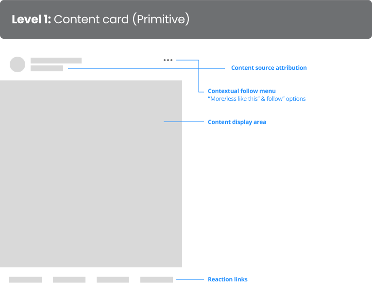
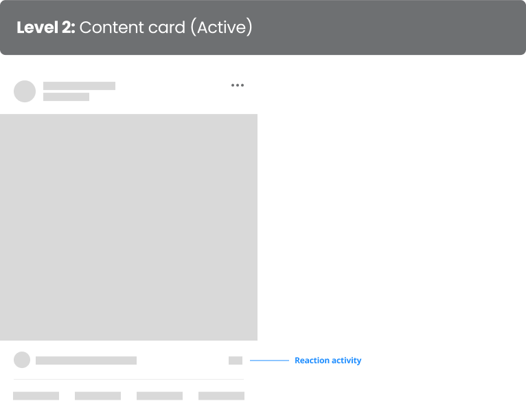
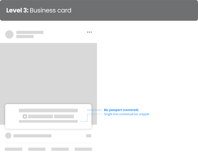
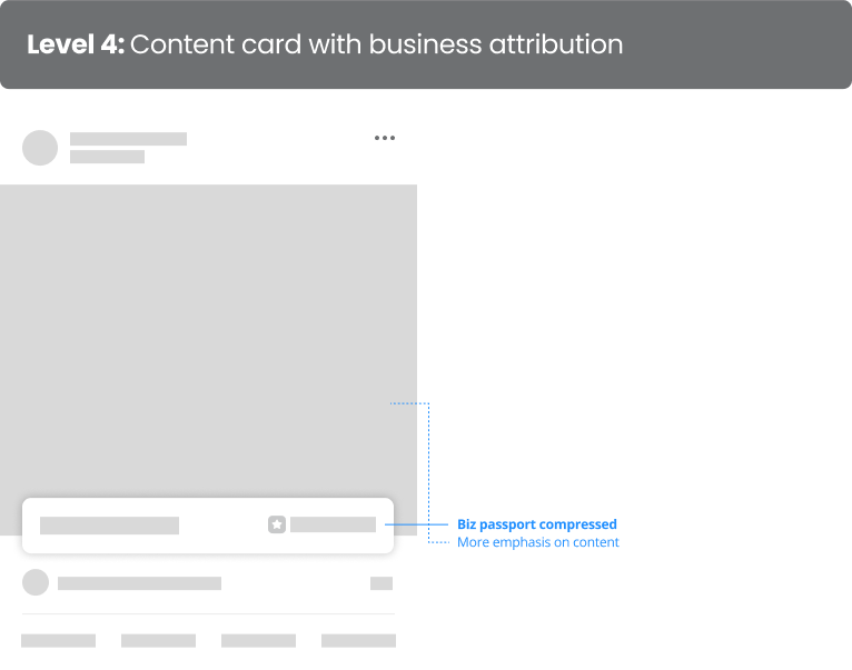
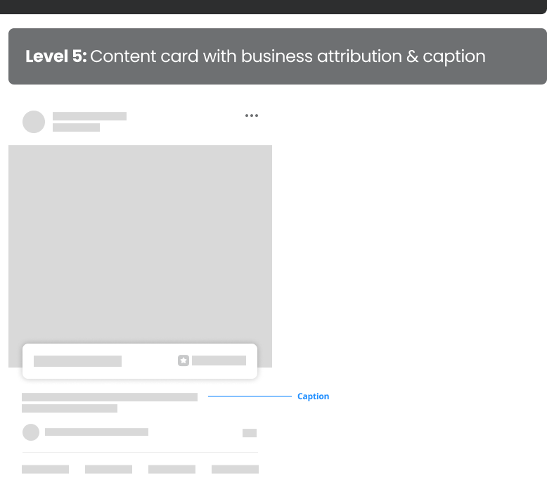
The foundational reusable card structure.
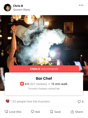
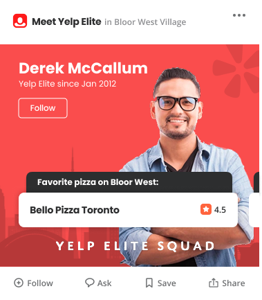
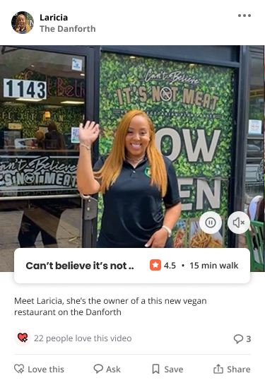
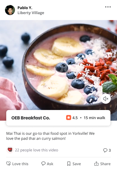
Better outcomes. Better systems.
The redesign delivered measurable gains for customers while giving Product, Design, and Engineering a shared system they could continue building on.
Beyond the metrics, the work shifted the conversation from "how do we improve the feed?" to "how do we build a discovery platform?" — opening the door to a broader set of product bets and wins.
Designing systems, not screens.
The most valuable outcome wasn't the redesigned feed. It was giving Product, Design, and Engineering a shared language for reasoning about discovery long after launch.
Interfaces change. Customer needs evolve. Organizations reorganize. Systems grounded in clear principles continue to scale through that change.
My goal isn't simply to ship better interfaces — it's to create clarity from complexity, build systems that endure, and leave teams with a stronger foundation than the one I inherited.
“Tony is a force of nature — an insightful designer, a fountain of ideas, and a committed champion for innovation and change. He had made a huge impact on our product and especially our innovation process and approach. I'd gladly work with Tony again.”